Living with PBC
Disease Education Website Redesign
Overview
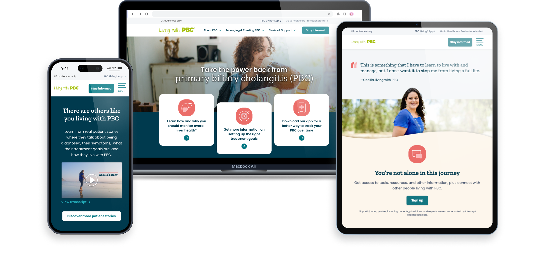
Facing a fast-approaching competitor launch and an outdated digital presence, our team was tasked with redesigning the PBC (Primary Biliary Cholangitis) disease education website for Intercept’s product Ocaliva. The goal was to modernize the website, aligning it with a new advertising campaign and ensure it resonated with patients, building a community feel and activating CRM registration.
Situation
The existing website had been updated in pieces over the years, resulting in a fragmented and outdated experience that wasn’t optimized for mobile users or engaging enough to keep visitors exploring. At the same time, the client had ambitious goals for the redesign, which didn’t always align with the tight timeline. With creativity and unwavering dedication, our team not only met the challenge but exceeded our client’s expectations, delivering a polished and impactful solution.
Role
UX/UI Product Design Lead
Team
Client Partner, Brand Strategist, Art Director, Copywriter, UX Designer, Project Manager, Submissions Coordinator, Developer
Timeline
4 months
Next-Best-Actions
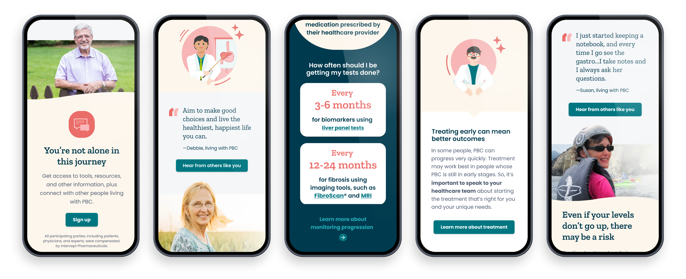
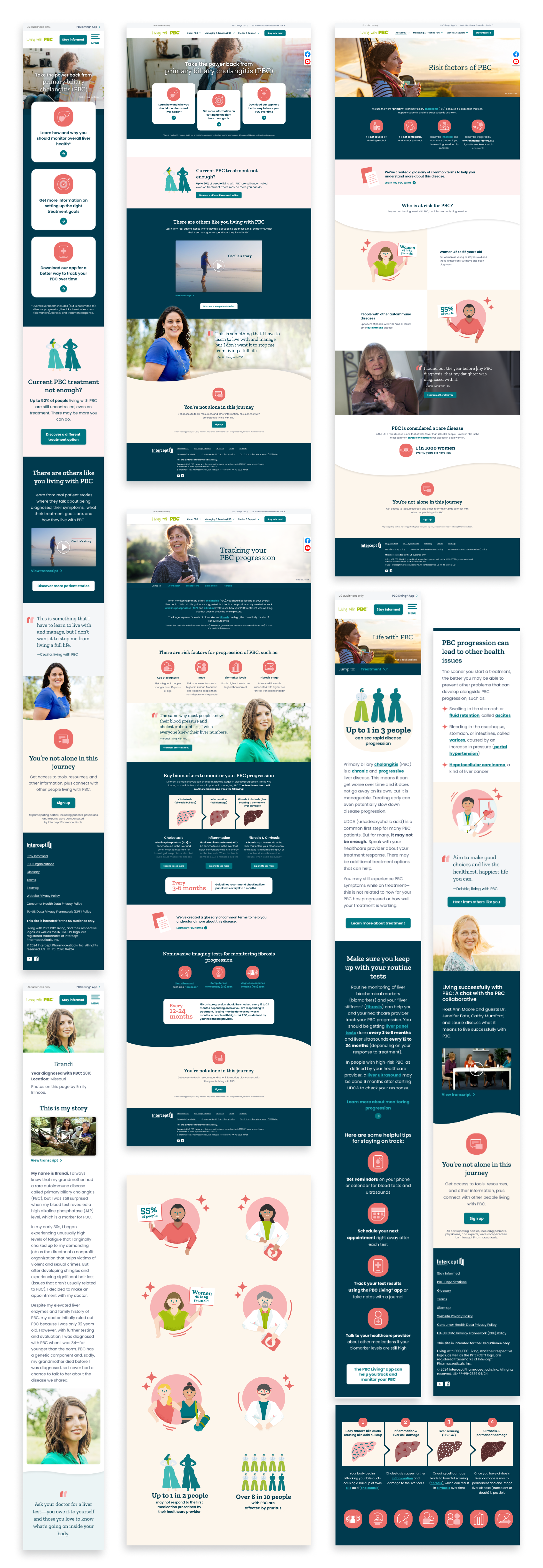
A key element of the redesign was implementing a strategic next-best-action framework to guide users through meaningful interactions on the site. I collaborated with our copywriter to carefully craft and place CTAs at pivotal moments in the user journey, encouraging engagement with patient stories, tools for monitoring their condition, and detailed treatment information.
By designing both primary CTAs for key actions and secondary CTAs for supporting interactions, I ensured that each was visually prominent, contextually relevant, and offered clear, actionable steps that aligned with user needs.
Performance
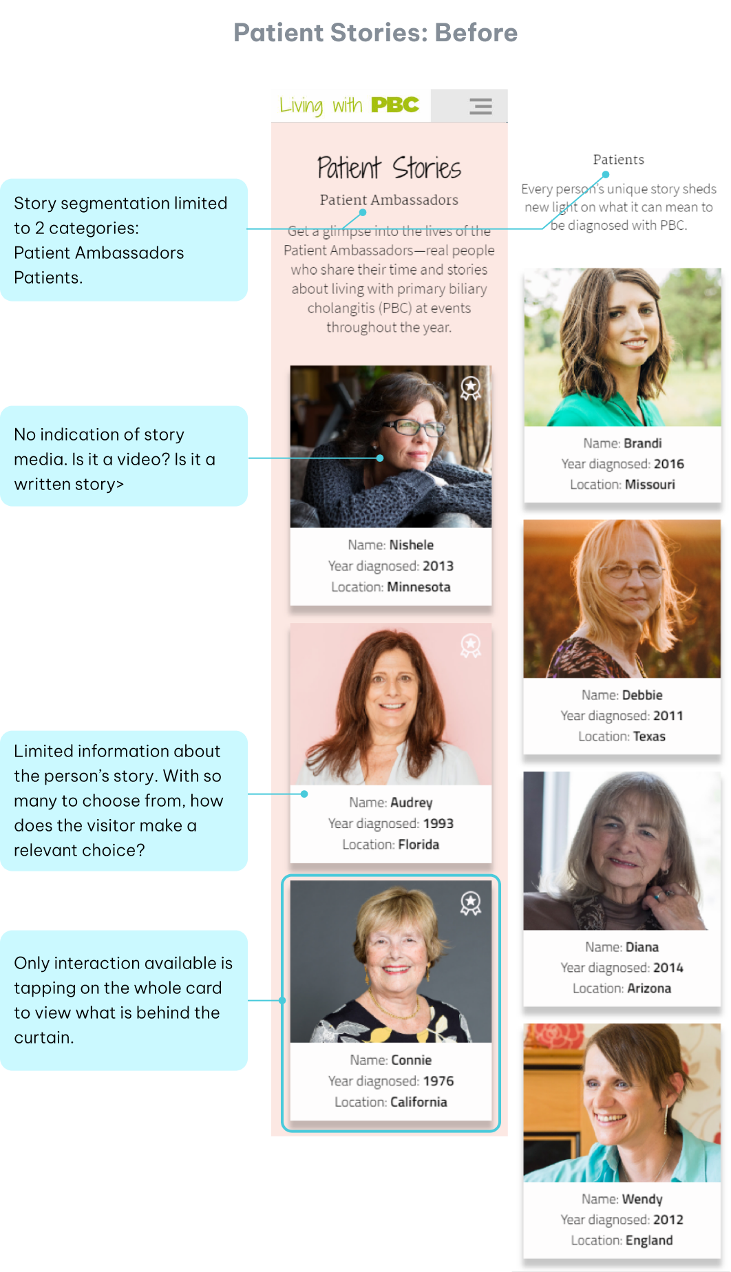
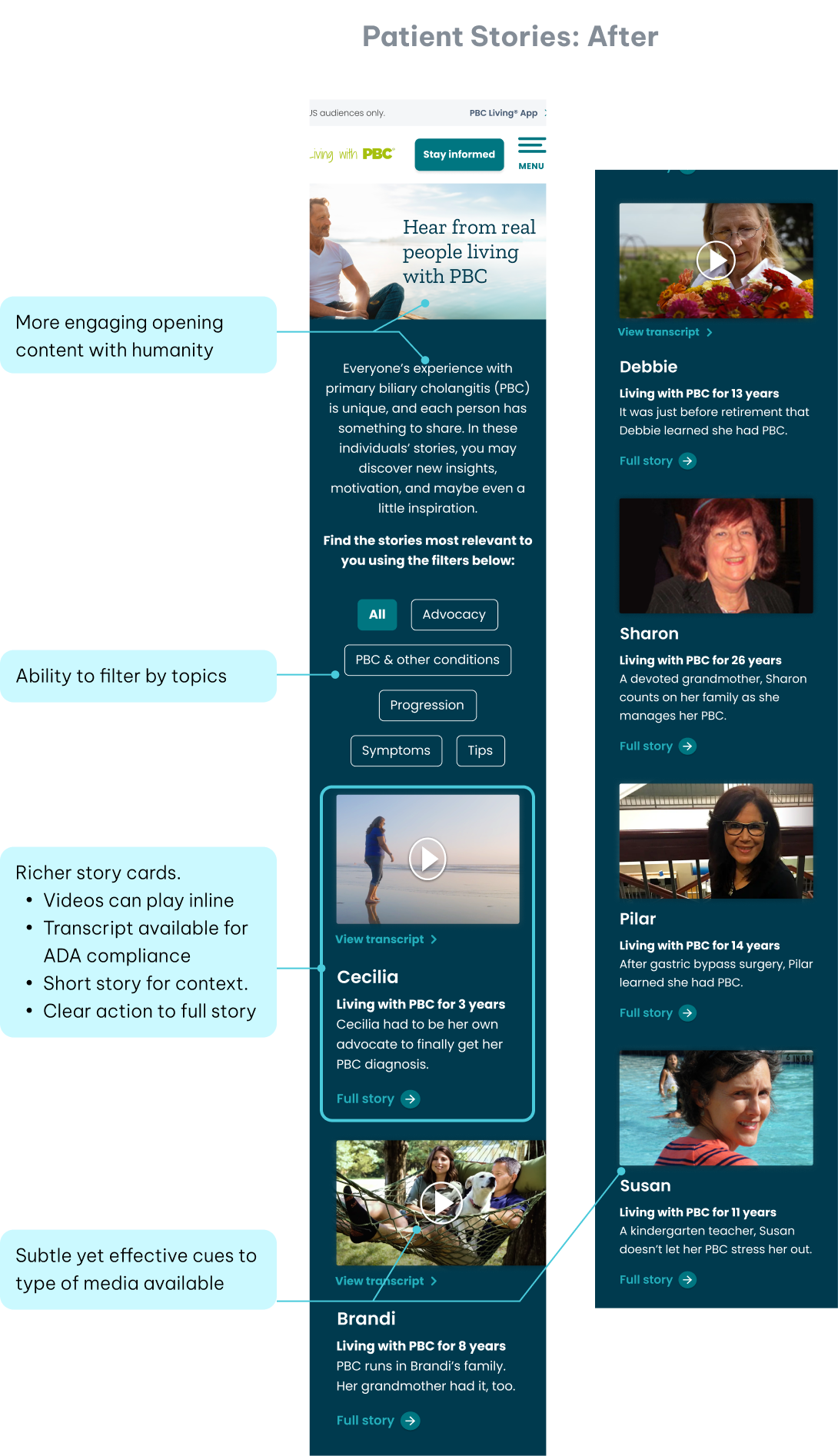
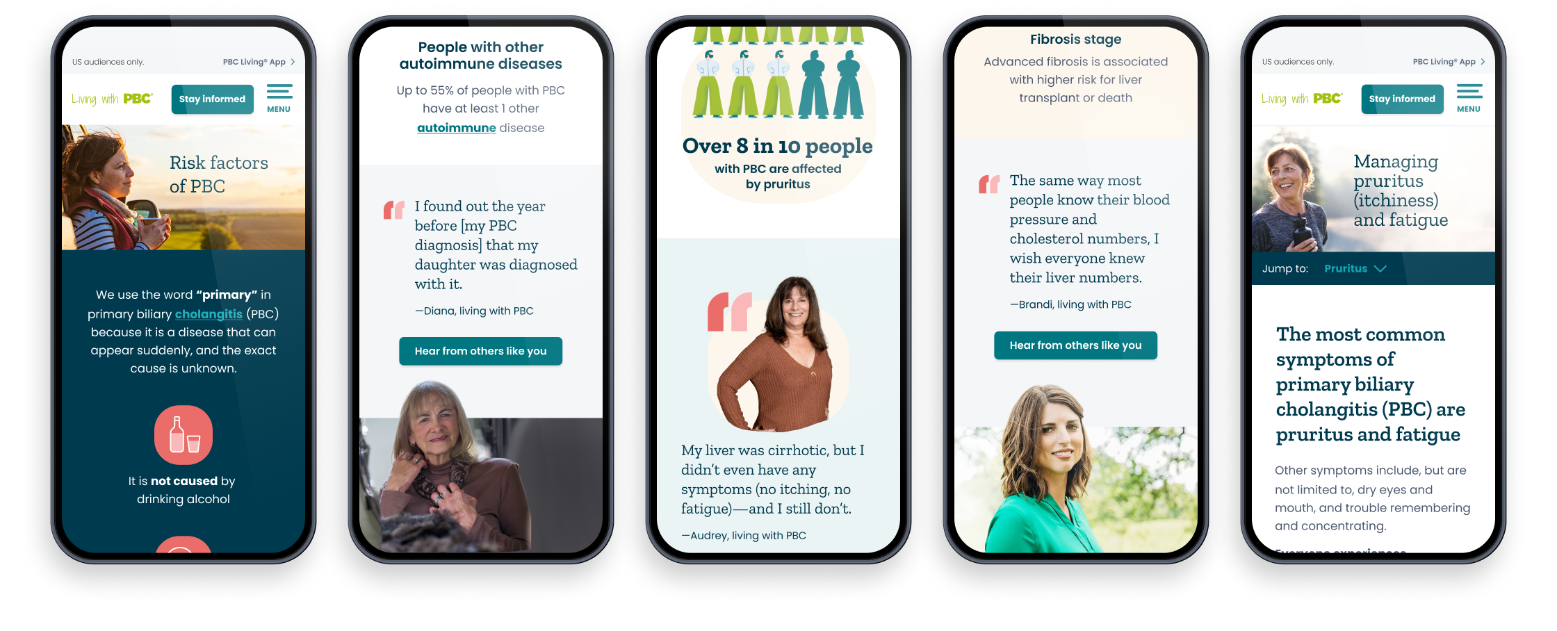
Optimizing Patient Stories
The redesigned Patient Stories page makes it easier for users to connect with the real experiences of people living with PBC. The old version was hard to navigate, with limited categories, little information about the stories, and only one way to interact—clicking the card for more details.
The new design starts with an inviting introduction and engaging visuals that immediately draw users in. Story cards now include richer details, like inline video playback, ADA-compliant transcripts, and short summaries that help users quickly find what they’re looking for. A new filtering system lets users sort stories by topics such as advocacy, symptoms, or progression, making it simple to discover relevant experiences. Subtle cues now show whether a story is a video or written, making it easier for users to identify and select the stories that resonated with them, ultimately increasing engagement.
Health More Human
Featuring real patients was central to making the site feel personal and approachable. We designed three different layout style components to incorporate their photos and applicable quotes, keeping the experience engaging and varied. This thoughtful approach brought humanity to the forefront, creating a sense of community leading to the increased engagement.
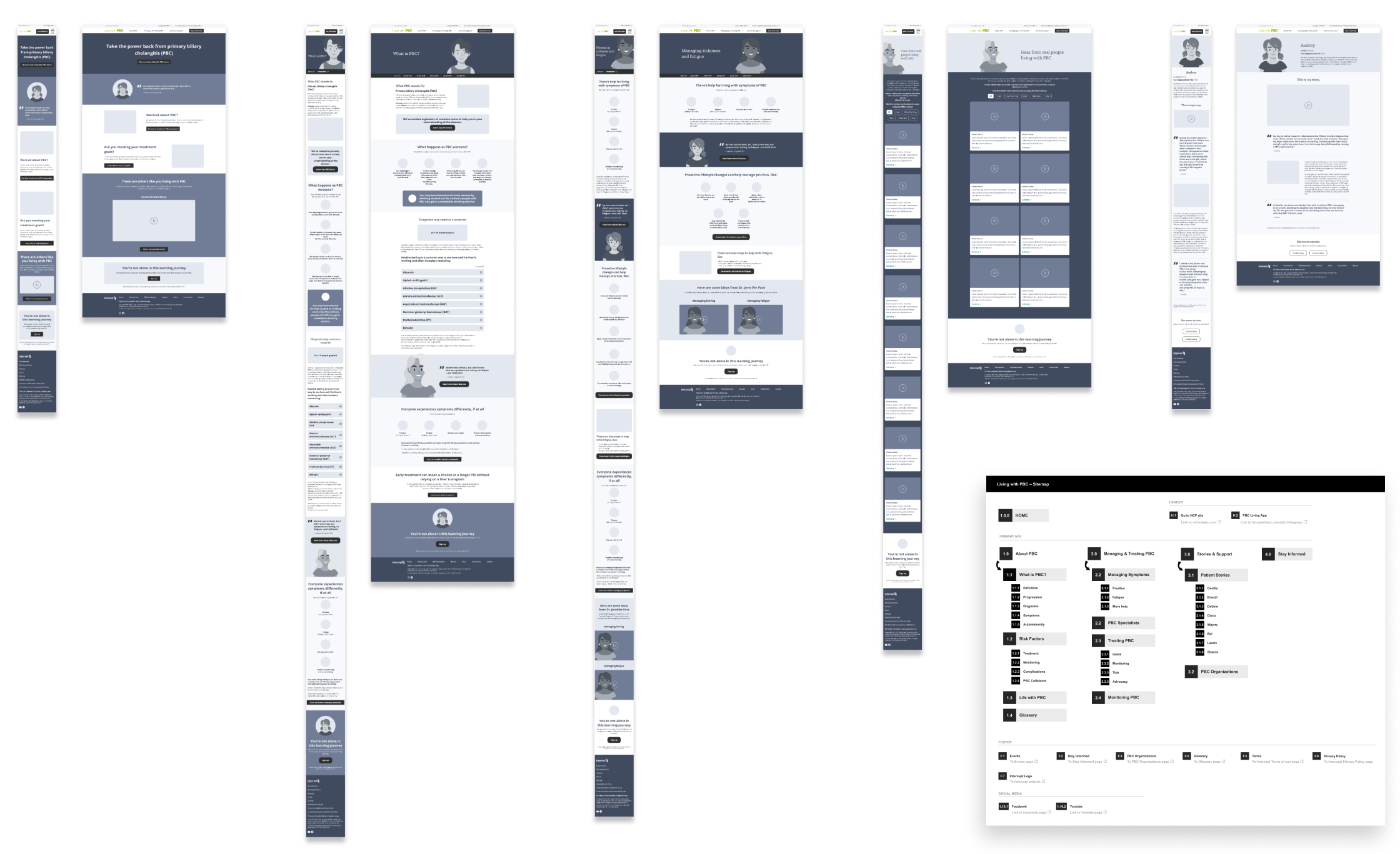
Process Artifacts: Wireframes and Sitemap
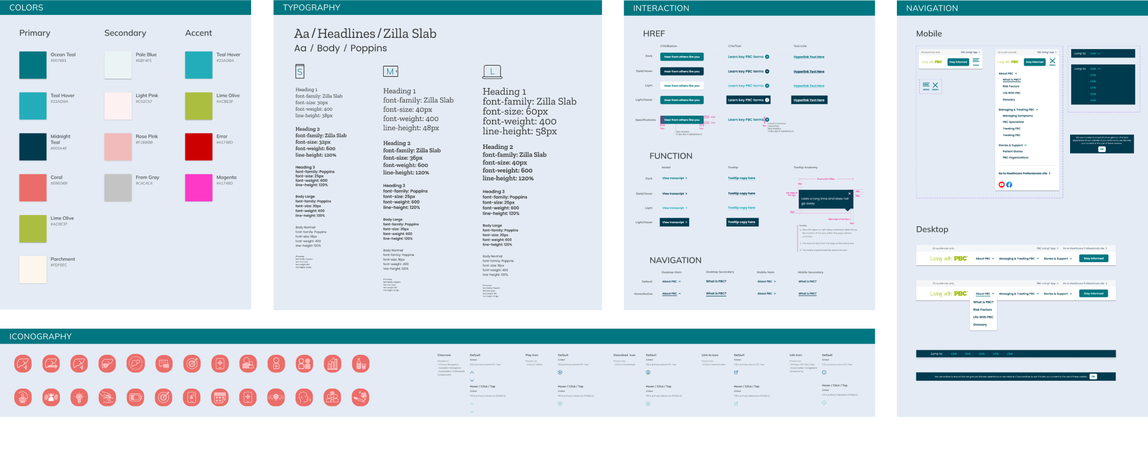
LWPBC Design System
Layout Screens
Contact
I am seeking a role as a full-time or freelance Experience Lead with a company in the NYC area that recognizes the value of design in driving business outcomes. I am particularly drawn to creating transformative customer experiences in financial services, while my extensive healthcare experience remains meaningful and offers immediate expertise.